Build your agent
Appearance
Colours, dark mode, animated launchers, position and size — with a live preview.
The Appearance tab controls how the widget looks on your site; the live preview on the right updates as you type.
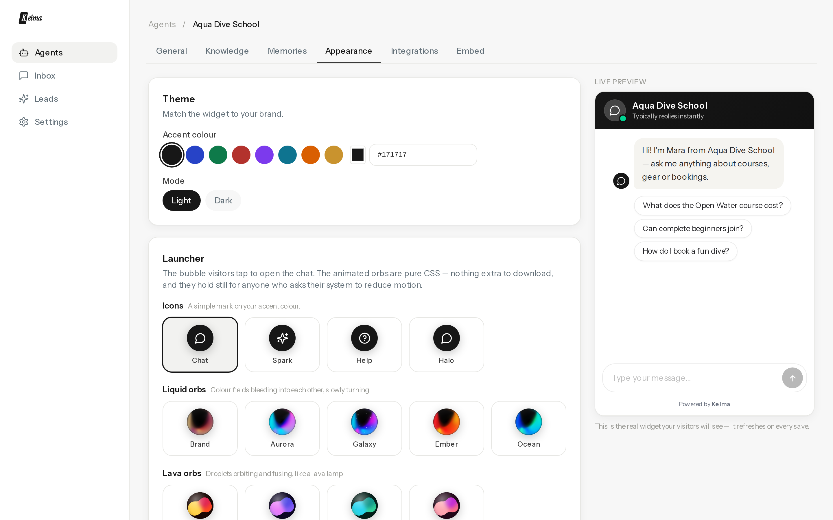
- Accent colour — any hex; buttons, visitor bubbles and the launcher follow it.
- Light / dark — match your site's theme.
- Launcher — a bubble plus an optional effect, picked separately, so any effect works on any bubble.
- Bubbles: Icons (classic glyphs), Liquid orbs (slow-blending colour orbs; Brand derives its palette from your accent colour), Lava orbs (blobs that fuse and split like a lava lamp), Glass (frosted, blurring whatever your page has behind it), and Your own (upload a logo, cropped to a circle). Need monochrome? Noir and Ink are the black-and-white members of the orb families and ignore your accent colour entirely.
- Effects: Halo (a ring pulsing outward), Breathe (a glow that swells and settles), Comet (a spark circling the bubble), Aura (an iridescent ring, slowly turning), Glint (a highlight sweeping across), Ping (an unread badge that pulses — red and white on every brand, so visitors read it the way they read every other badge) and Sparkle (twinkles around the rim).
- Everything but your uploaded image is pure CSS, and all of it holds still for visitors who ask their system to reduce motion.
- Position & size — bottom-right or bottom-left; launcher 40–80 px; panel width and height for desktop. On phones the chat always opens fullscreen.
- Welcome bubble — a small teaser next to the launcher before the first open.
- Proactive engagement — instead of waiting, the widget opens the conversation at the right moment: after time on page, at a scroll depth, or on exit intent (desktop). It fires once per visit, pops the greeting bubble with a gentle nudge, and never interrupts an open chat. Optionally let the AI write the opener per page — a line that fits what the visitor is looking at ("Looking at pricing? Happy to explain the plans."). AI openers are cached in the visitor's browser for a week and metered like a normal message; your own opener text stays the fallback.
- Chat sounds — off by default. Turn it on to play a short, quiet cue in the widget when a new message arrives (an agent reply or a message from your team). Choose from five sounds — Chime, Pop, Ding, Marimba, Bubble — and press play to preview each. Visitors can mute it themselves with the speaker icon in the chat header, and their choice is remembered on their device.
Per-page overrides are available on the embed snippet (data-color, data-position, data-size…) — see Embedding.